IDDSI is a committee of health professionals around the globe that aim to develop a standardized dysphagia diet language. Dysphagia is a swallowing disorder that affects adults and the elderly around the world. Their aim is to be person-focused over professionally focused, and promote a diet language that will work with all cultures and be used and promoted by several clinicians, caregivers and health practitioners.
THE PROBLEM:
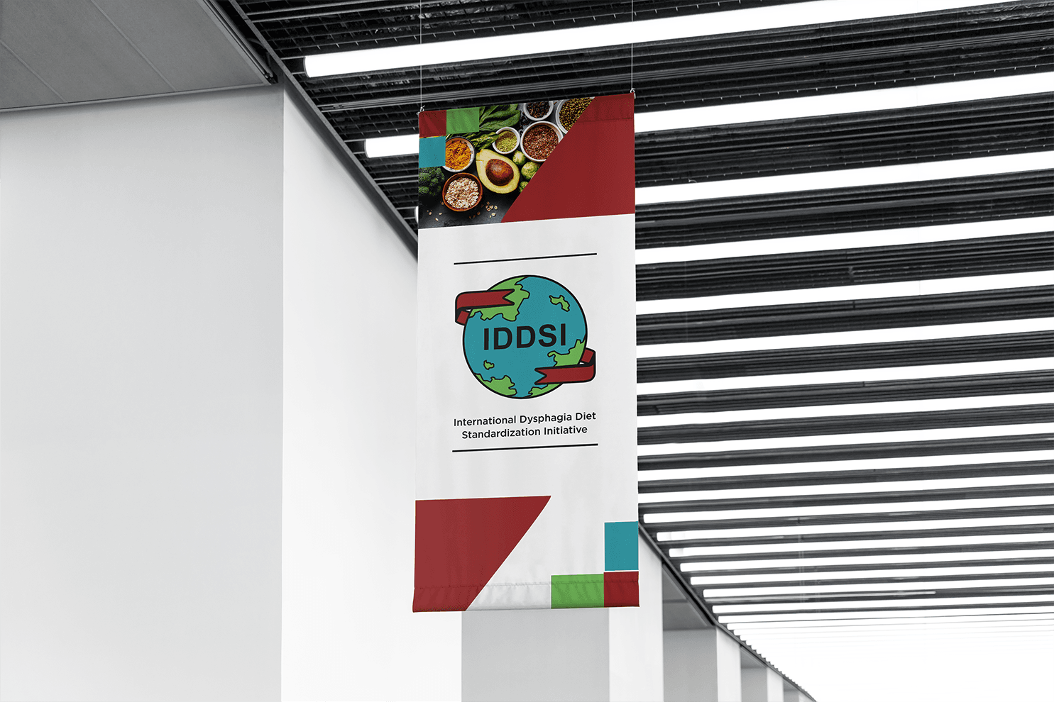
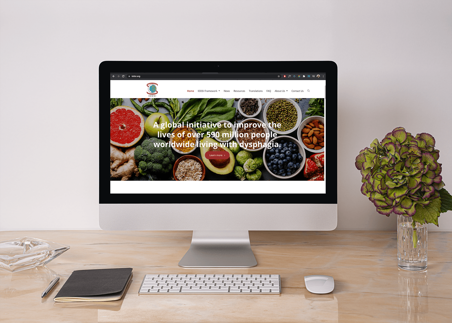
IDDSI needed a new logo with better functionality. They wanted to refresh the old one while retaining signature traits. The colour palette needed to remain the same, the logo needed to be in a square orientation, and the ribbon around the globe was to remain in some way.

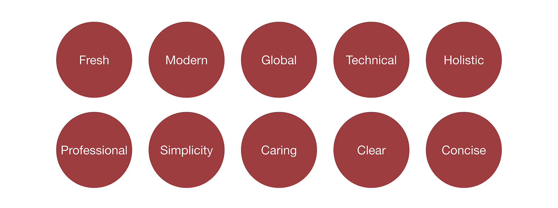
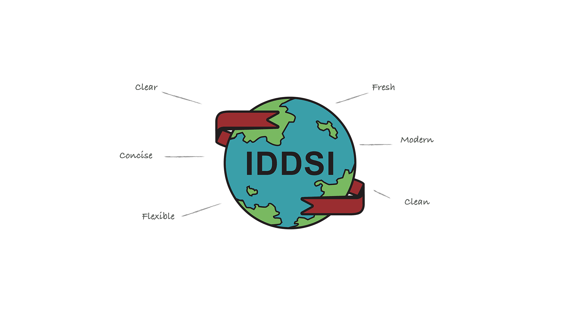
Brand Attributes
Based on the design brief, these were the brand attributes that best described IDDSI and their mission. They wanted the logo to at least encompass a few key traits.
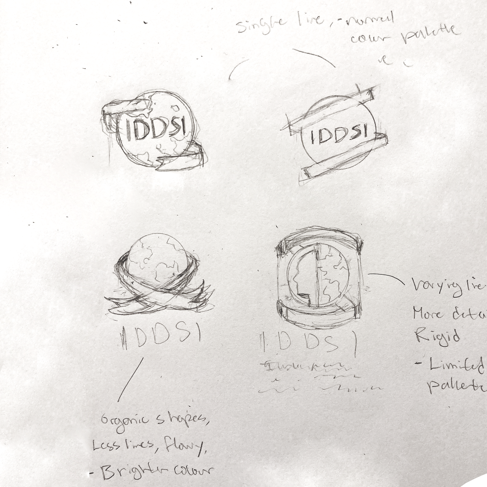
Initial Sketches
Logo Variations
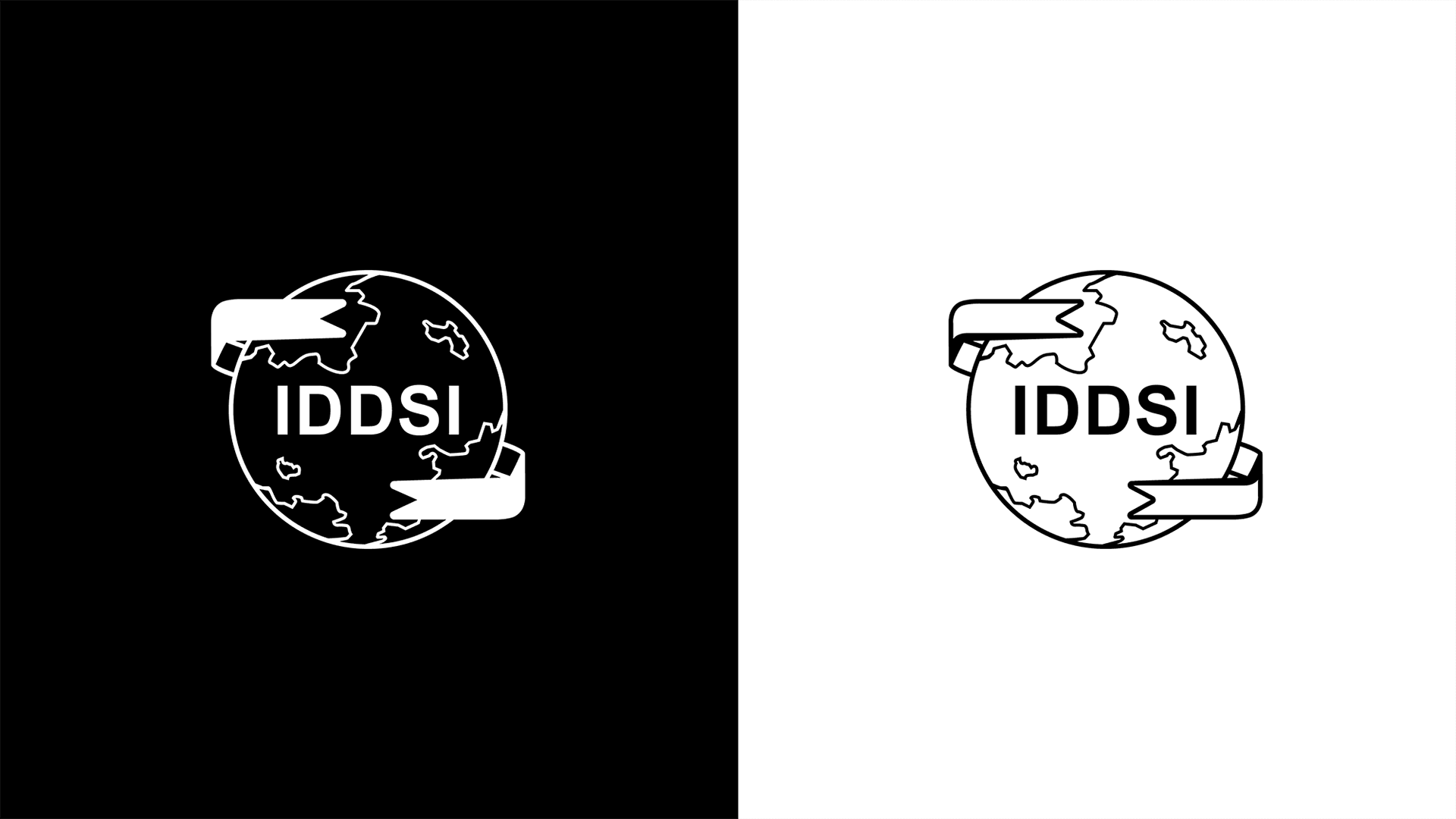
This first version was a straight 1:1 refresh of the old logo. I made a flat design with bold defining lines and the same colour palette, but with more prominence.

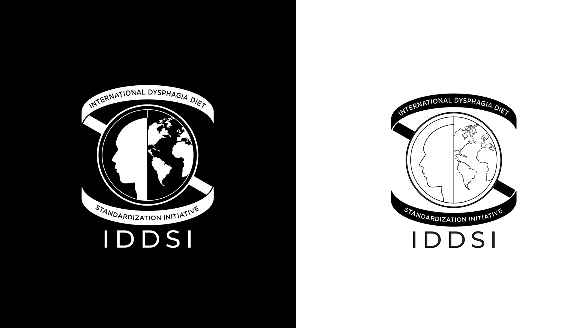
The second version focuses in on representing a global, medical organization. Leaning very much toward a UNICEF type look.
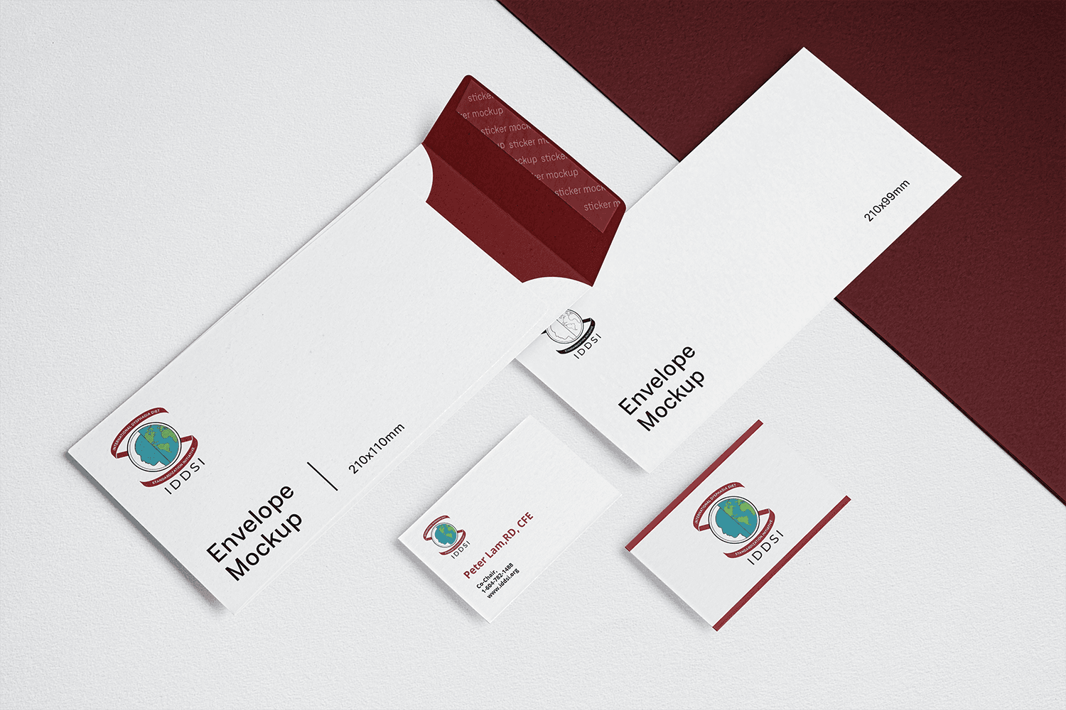
Application Mockups

Thanks for stopping by!