THE PROBLEM:
Dr. Lucas Pain needed a logo and brand consultancy for his private chiropractic practice. He was looking to launch a website, and have his main vision carry the look and feel of the brand. He sees chiropractic treatment as a way for his clients to get a restart in life, and leave behind days, weeks, or even years of chronic pain.
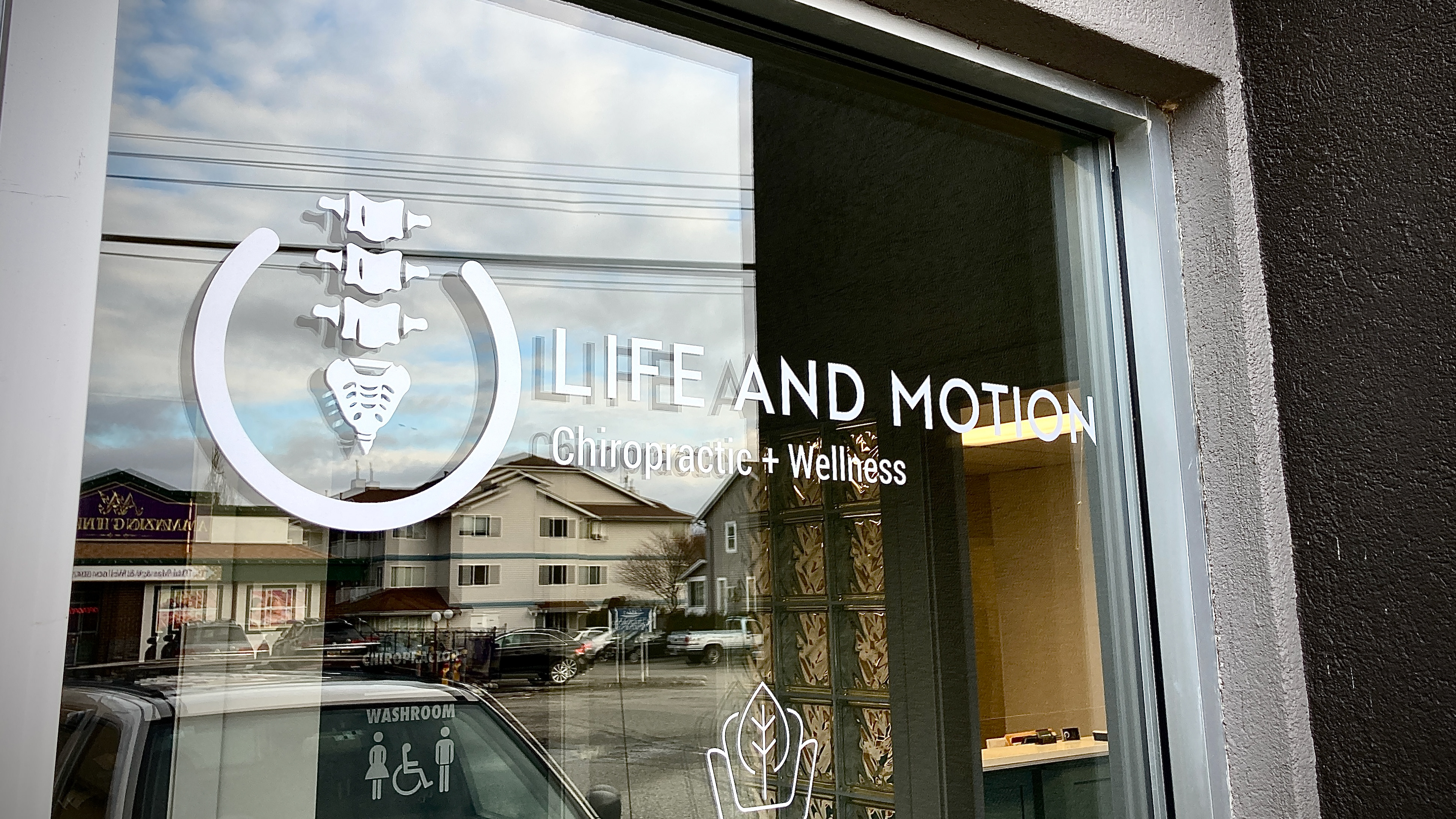
His main idea behind the logo was the power symbol for electronics combined with the spine. A literal power up in life. I felt this lined up perfectly with his approach to chiropractics.
_______________________________________________________________________
Logo Work



Logo Application & Signage




Website & Art Direction
Photography Mood Board


Hero Image
Thanks for stopping by!