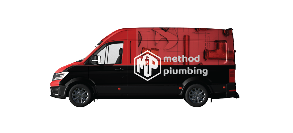
THE PROBLEM:
Method plumbing is the solo-preneur venture of a red seal plumber based in Calgary, Alberta. He was looking for branding that would set him apart from the many large, often generic looking rival companies in the city. He's looking for something bold, but reflects his professionalism and methodical approach to projects.
The Brief
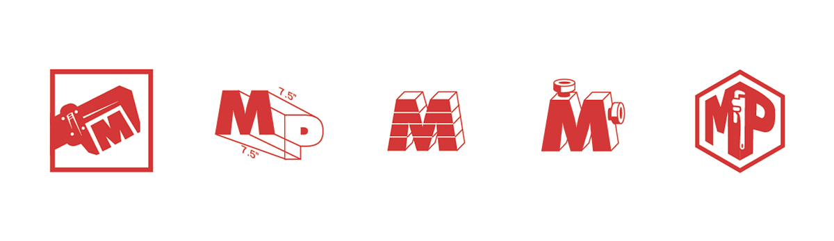
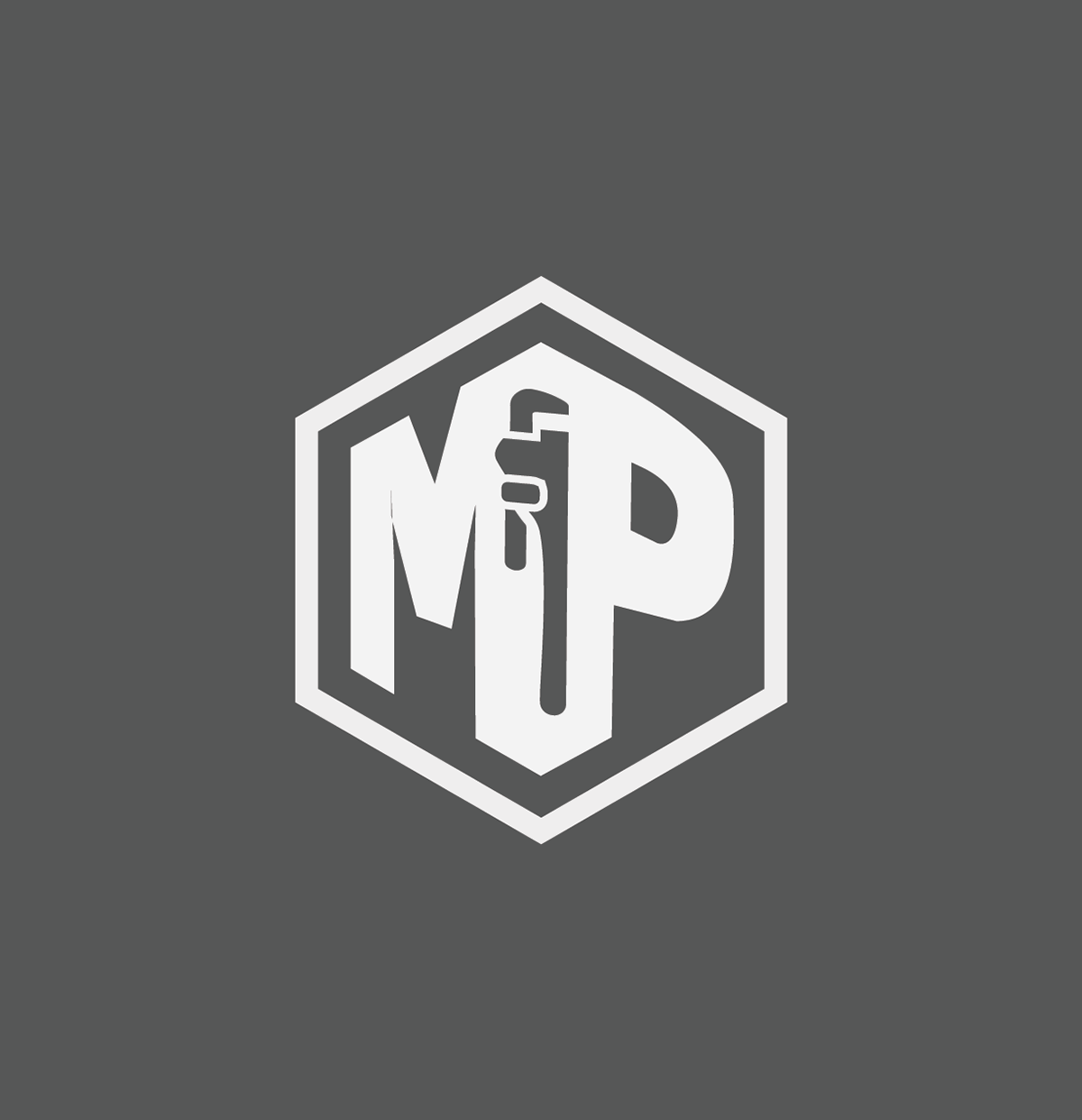
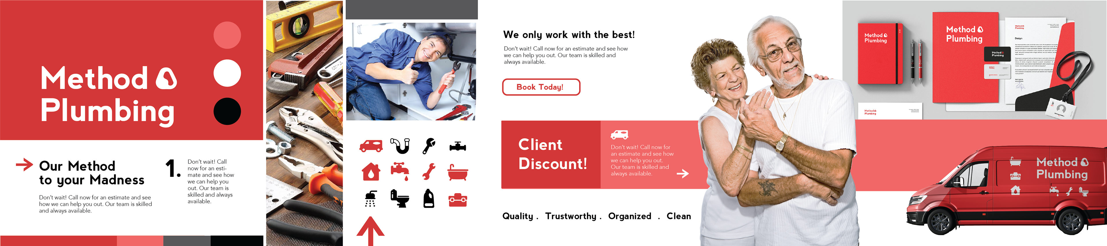
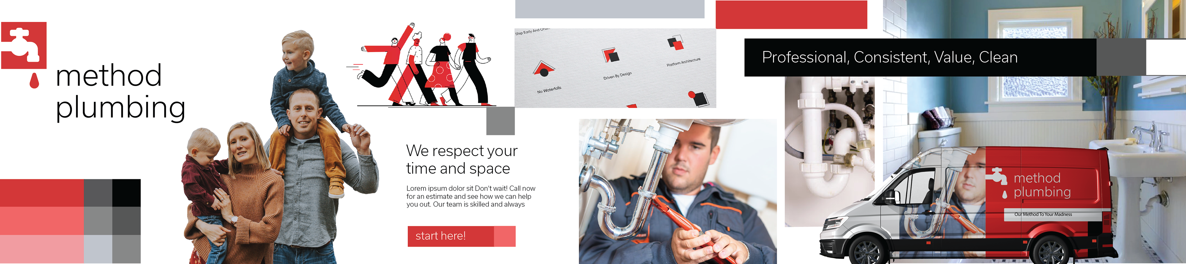
The client didn't have a clear idea for the logo or visuals. He knew he wanted it to be red and black, but first and foremost, the brand needed to communicate his core values. Cleanliness, professionalism, confidence, and quality became the main attributes of the brand. The visuals included technical, but bold visuals highlighting the expertise of plumbing. In the end, I landed on a simple but bold logo, and a more vibrant colour palette.
____________________________________________________
Logo Exploration
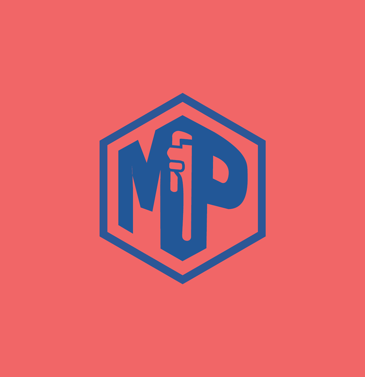


Brand Stylescapes
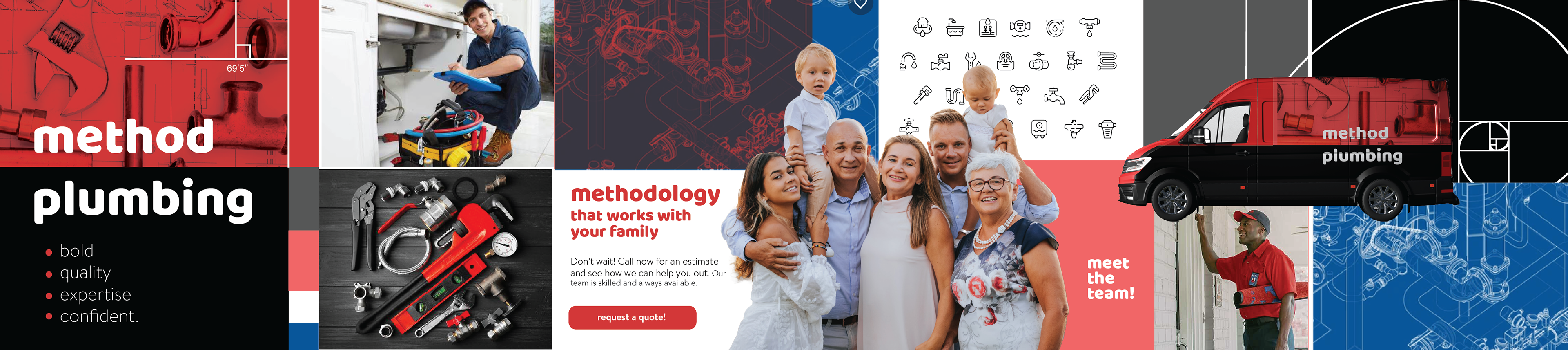

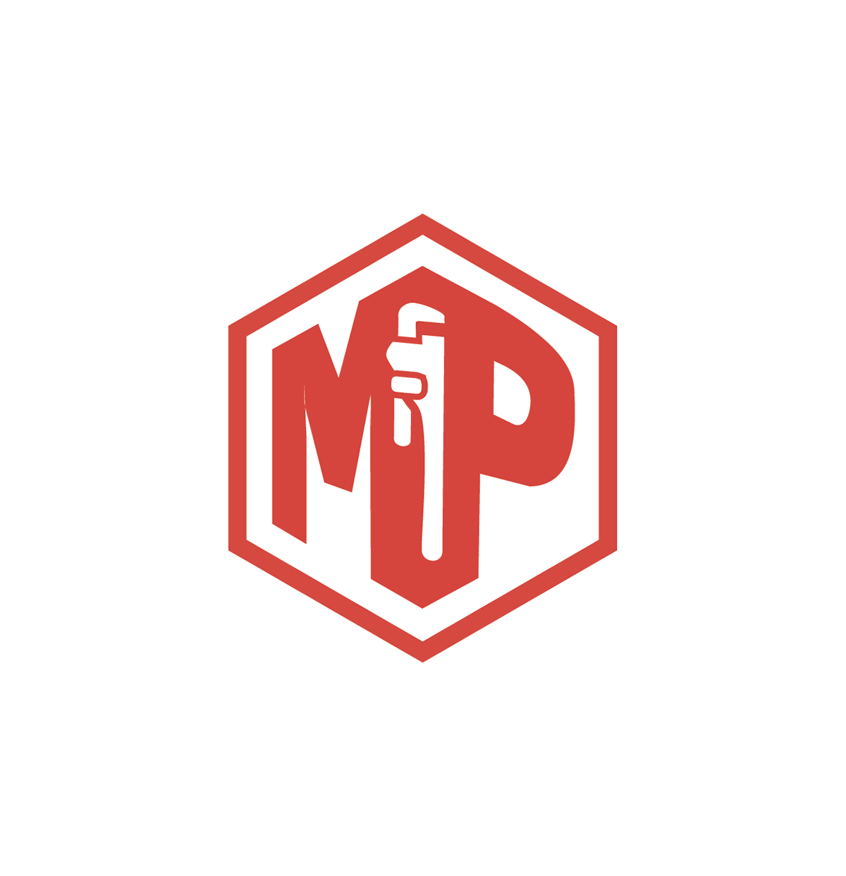
Final Brand Identity
The client chose the third option, with the blue, black and red colour palette. He felt that both the visuals and the demographic of the target audience fully represented what he wants to convey.
Website & print material coming soon!
Thanks for stopping by!